
A coherent film can move through different light without losing its visual identity.
2. Build a three-shot review record.
Give each shot an identifier and describe its role before discussing a treatment. In the fictional sequence below, the problems are invented to illustrate a review method. They are not observations from the Explore images placed alongside the article.
| Shot | Intended role | Hypothetical mismatch | First review decision |
|---|---|---|---|
| A / Street arrival | Cool exterior establishes the night. | None; this is the approved reference for shadow depth. | Retain its mood and use it as one comparison point. |
| B / Entrance | Connect outside and inside. | Dark clothing looks grey and a coloured sign dominates the face. | Review contrast and the sign separately. |
| C / Performance space | Warm light marks the arrival. | A bright practical light overwhelms a small area. | Preserve warmth while evaluating the highlight. |
This record separates an intended transition from accidental inconsistency. Shot C should not be forced to look like the street. Shot B should help the viewer cross between the two environments. The reference is therefore a guide to selected qualities, not an instruction to copy every colour from one frame onto another.

Choose representative reference frames, not just the most dramatic thumbnail. If a flash or passing light occupies one moment, that frame may be a poor description of the rest of the shot. Retain the timecode of each reference so everyone can compare the same moments.
3. Check the technical baseline before judging the look.
Before changing colour creatively, confirm how the source files are being interpreted in the editing application and what output is required. Ask the editor or colourist to check the files’ colour information, the project’s colour handling and the intended delivery format. A mismatch in that chain can make a clip appear unexpectedly washed out or overly contrasty.
Do not apply a camera conversion intended for a particular source simply because the image was AI-generated. Generation is a production method, not a description of the file’s colour encoding. Use the actual file information and the chosen workflow. If information is missing, resolve it with the person responsible for the assets rather than inventing a camera profile.
In our fictional example, the producer first asks whether all three clips are being viewed through the same intended output setup. Only after that check should the team decide whether the grey-looking clothing in shot B needs a creative adjustment. Otherwise, one correction may compensate for another mistake and become difficult to reproduce later.
Keep an unchanged source and a clearly named working version. Document any agreed technical conversion separately from the creative look. This makes it easier to understand whether a later change came from source interpretation, shot balancing or an overall treatment. The film handover guide covers the broader record of approved masters and working assets.
4. Compare the reference and target with a specific question.
Side-by-side comparison is useful when the question is precise. For shot B, compare how much separation remains between the jacket and the background. Then assess the coloured sign. Avoid moving every control at once merely because the images feel different.
Adobe’s Premiere documentation describes Comparison View for displaying a reference and target frame, including side-by-side and split views. It also explains that Apply Match adjusts colour wheels and saturation, and advises choosing a representative frame when a clip changes over time. This documents the tool’s behaviour; it does not establish that an automatic result is the right creative finish. Source: Adobe’s shot-matching guidance.
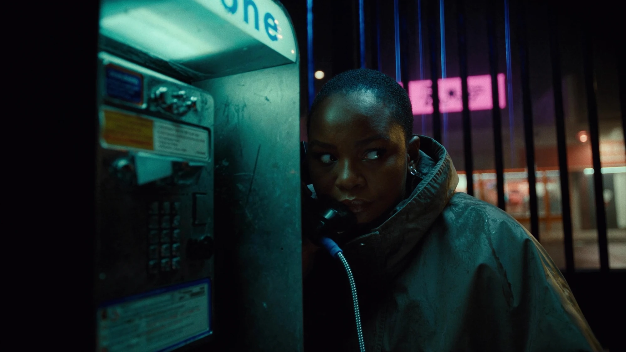
For the invented entrance shot, the proposed order is to inspect the dark tones, check whether the face remains readable, and then decide whether the sign needs a more local adjustment. A change that helps the jacket but makes the face too dark is not a finished solution. Review the relationships together after each meaningful adjustment.
Scopes can support a colourist’s assessment of levels and distribution, but the creative target still needs to be agreed. Two compositions can contain very different proportions of darkness and still belong together. Do not demand identical scope shapes from a close portrait and a wide room simply because they appear in the same sequence.
Preserve a version before trying an automatic match. Adobe notes that some existing Lumetri settings can be reset during matching. A clear version history makes it easier to compare the result and recover a preferred treatment. Source: Adobe’s matching notes.
5. Protect the colours that carry meaning.
Some colours are atmosphere; others identify a product or form part of a brand’s visual identity. Decide which is which. A warm light can reasonably influence how a jacket appears in a scene, but a client may still need its approved colourway to remain recognisable. That requires a specific conversation about the image’s purpose and the limits of the treatment.
In the fictional venue film, the sign is a recurring accent rather than a product specification. It should remain recognisable without taking attention away from the person entering. The finishing note should name that hierarchy. “Less neon” is open to interpretation; “Reduce the sign’s dominance while retaining the cool entrance atmosphere” explains what success means.
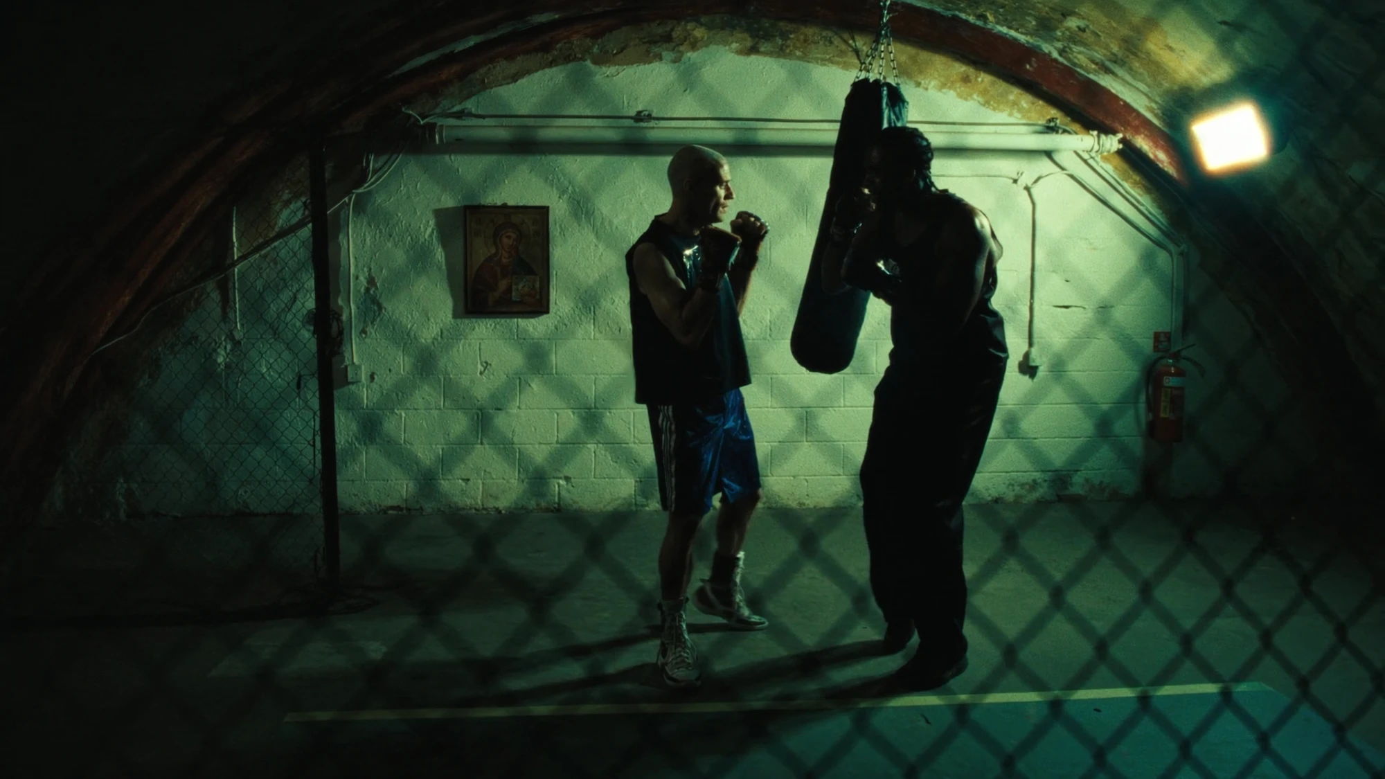
Skin needs the same contextual care. Coloured light can be intentional, and there is no single skin colour that every person or scene should be pushed towards. Review the person’s appearance in the agreed lighting context, using appropriate references where identity matters. Avoid treating a global warmth adjustment as a substitute for checking the whole face and surrounding scene.
Colour grading also has limits. It cannot reliably restore detail that is absent from the supplied image or correct a changing object shape. If the problem is a generated face drifting between frames or an invented logo, send it back to the relevant production stage. The image approval checklist helps separate content defects from finishing decisions.
6. Review the cut, then write an actionable note.
A matched pair of still frames is not the final test. Play the entire sequence at its intended speed. In the fictional film, the cut from A to B should feel like entering the venue, and the cut from B to C should reveal the warmer performance space. Watch for distracting brightness jumps, unexpected changes in the face and coloured details that suddenly become dominant.
Then inspect each clip from beginning to end. A representative frame cannot show a light that changes halfway through the shot. If an unwanted shift appears over time, record the interval and describe it. The colourist may need an adjustment that varies through the clip, or the source may need repair. Do not assume one still-frame correction has addressed the entire duration.
FICTIONAL FINISHING NOTE / SHOT B
Keep: the cool entrance atmosphere and the warmer reveal into shot C.
Change: restore separation in the dark jacket and reduce the sign’s dominance over the face.
Reference: compare jacket depth with approved shot A; do not copy its overall colour onto the interior.
Review: show the revised B in the complete A–B–C sequence, with the previous version available for comparison.
Give feedback against a named export and timecode. Agree the review setup and use the same file for the decision. Checking an additional phone or laptop is useful for spotting practical viewing problems, but casually comparing different screens and brightness settings is a weak basis for precise approval. If a client sees a discrepancy, establish the viewing conditions before changing the grade again.
Professional work also makes the finishing role explicit. Company 3’s advertising portfolio, for example, separately credits colour on projects including HSBC’s The Right Wave and Gap’s Denim on Your Own. Those credits establish responsibility, not the techniques used or any AI involvement. The practical lesson for a buyer is to name who owns the final colour decision in their own project. Source: Company 3’s project credits.
Approve the sequence once its intended differences and shared qualities are both working. Keep the approved export, reference frames and final notes together. A good match is a relationship between shots, judged in context; a shared preset alone is not the approval criterion.
Sources checked 16 October 2026. The venue, three-shot sequence and finishing notes are fictional and have not been graded or tested. Explore images are independent visual references, not one campaign, source-to-result comparisons or examples of a verified correction.
FINISH WITH INTENTION
A shared world.
A deliberate finish.
Bring the sequence and the feeling you want to preserve.
Discuss your project ↗