
Review the idea, check the facts and inspect the final placement. A clear approval process connects an attractive image with a deliverable the commissioning team can confidently use.
1. Agree what “ready” means for this image.
An AI campaign image is ready when it meets the creative brief, preserves the facts it needs to represent and works in its intended layout. None of those conditions can be established by a resolution label alone. A sharp image may show the wrong fastening. A beautiful composition may leave no usable room for copy. A convincing portrait may still need careful edge work.
Begin approval with a short list of requirements. Separate the details that cannot change from the details open to interpretation. For a real jacket, pocket placement and construction may be fixed while the setting is flexible. For a speculative fashion concept, the whole garment may be invented. The reviewer needs to know which situation they are looking at.
Our recommendation is to attach the reference, the approved direction and the intended placement to the review. Otherwise one person assesses atmosphere, another checks colour against a different image, and a third assumes a draft is final. A named version and a shared source of truth make the decision much clearer.
APPROVAL PRACTICE
Write a concrete acceptance statement.
“The jacket must match the approved front and detail photographs, the subject must remain readable in the portrait crop, and the final headline must fit the supplied layout.” Each part can be checked.
2. Review at three useful scales.
First, look at the complete image. Ask whether the idea reads immediately, whether the composition leads the eye appropriately and whether lighting and perspective feel coherent. This is the creative review. Do it before becoming absorbed in individual pixels.
Next, inspect the supplied file at actual pixels, commonly described as a 100% view in an image editor. Move through the image systematically. Look at hands and contact points, repeated patterns, lettering, jewellery, hair edges, reflections and transitions between materials. Inspecting one attractive central area is not enough. A small distracting object near the edge can become prominent in a later crop.
Finally, review the actual layout at a realistic viewing size. A detail that matters in a large print may disappear on a phone; a busy background that seemed harmless in a large preview may compete with small copy. These views answer different questions. Keep notes tied to the relevant output rather than treating every visible imperfection as equally important.
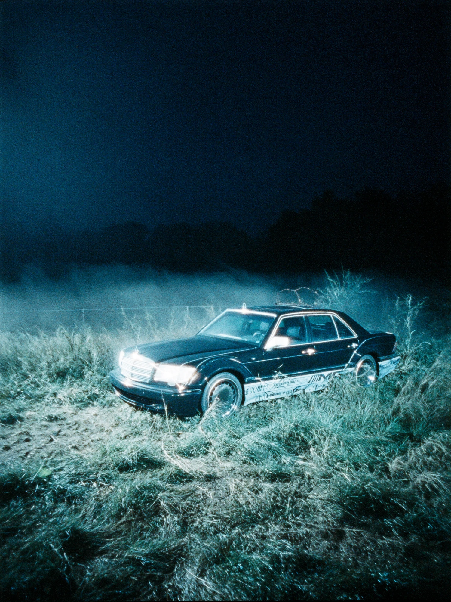
The cover image offers another useful distinction: fine snow texture, transparent lenses and small lettering each need a different kind of attention. Strong surface detail does not establish that the lettering or object construction matches an approved reference.
3. Check identity against evidence, not memory.
For a real product, place the supplied image beside an authoritative reference. Check overall silhouette first, then construction, material boundaries, markings and proportions. Do not ask a reviewer to remember which seam belongs where from a meeting held several days earlier.
Where a detail is hidden, ask for another reference angle or clarify whether it must be shown. An appealing invented solution is not evidence of how the object is made. If the image needs to communicate a feature accurately, use source photography, approved artwork or a validated asset to resolve that feature. The appropriate correction may involve compositing or retouching rather than another broad generation.
| Area | Compare with | Useful feedback |
|---|---|---|
| Shape and construction | Approved photographs, dimensions or validated model | “The left pocket opening is too high relative to the seam.” |
| Logo and wording | Approved artwork and copy | “Replace the lettering with the supplied mark.” |
| Colour and finish | Agreed product reference and colour-review conditions | “The finish reads glossy; the reference is matte.” |
| Interaction | Reference for the intended grip, fit or action | “The strap should pass behind the shoulder, not through it.” |
| Setting | Approved art direction | “Retain the cooler background and remove the new warm highlight.” |
A reference can also have limitations. A compressed messaging-app image may not be suitable for judging subtle material texture. Identify the best available source and record unresolved questions explicitly. “Looks plausible” and “matches the product” are different approval statements.
4. Recheck the image after upscaling.
Upscaling belongs in the review plan because it can affect how detail appears. Do not approve a small draft, enlarge it with an interpretive process and assume the earlier approval covers the new file. Compare the result with both the pre-upscale image and the underlying product or creative reference.
Magnific's documentation distinguishes Creative mode, which can reimagine or add detail, from Precision mode, which it positions for faithful enlargement, including products and print. The guide also advises comparison with the original. These are the vendor's stated behaviours, not a guarantee that a particular output preserves every feature. Source: Magnific Image Upscaler documentation.
Choose the purpose before the setting. If the job is to retain a specific weave, engraved mark or face, additional invented texture may be undesirable even when it looks impressive. If the brief is an expressive illustration, some interpretation may be welcome. Record the tool and settings actually used so a later reviewer can understand what changed.
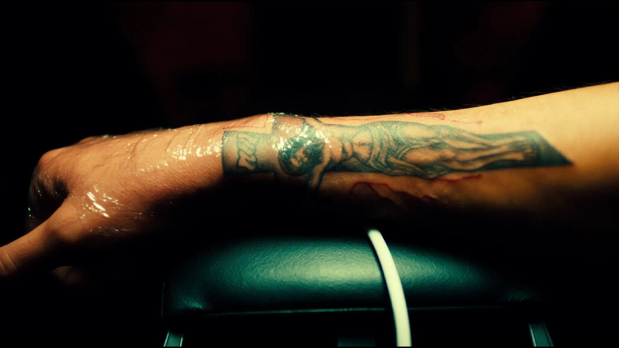
Review local contrast as well as detail. An aggressive finish can make a previously subtle edge distracting. Ask whether the result still belongs to the agreed visual direction, then retain the earlier approved source so a correction does not require reconstructing the whole image.
APPROVAL PRACTICE
Make enhancement a reviewable step.
Keep the pre-enhancement file, the result and a short change note together. Mark the regions that must stay faithful. Approve the result in its final layout before exporting the delivery set.
5. Decide whether to retouch, regenerate or change the source.
Not every problem deserves the same remedy. An isolated edge issue may be suitable for retouching. A composition that fundamentally misrepresents the product may need a different source or a new production approach. Repeatedly regenerating an otherwise approved image can create new work by changing details that were already correct.
Use a simple decision rule: identify the smallest controlled change that can satisfy the requirement, then check the surrounding area again. A corrected logo still needs believable perspective and integration. A replaced hand still needs a coherent relationship with the sleeve and object. Local work does not remove the need for a whole-image review.
In Singapore, AI Studio describes an agency service that includes reference inputs, art direction, retouching and final approval. Its portfolio separately labels standalone showcase frames and fictional demo brands. Those are provider descriptions, not independent evidence that every output is accurate. The useful buyer question is what reference and approval evidence will be supplied for your own deliverables. Source: AI Studio's service description; portfolio disclosures.
This is where an approval process adds value beyond a gallery of attractive results. Ask to review a representative difficult image early, including a detail that matters to your actual brief. A strong atmospheric example may show visual taste while leaving product accuracy untested.
6. Apply the checklist to a fictional footwear image.
Imagine an unbranded trainer campaign requiring a portrait hero image and a square social card. The outsole pattern, number of lace eyelets and panel shape must match approved product photographs. The street, lighting and styling can be art-directed. This is a fictional commissioning exercise, not a Nightwolf project or a tested generation.
At the first review, the atmosphere works but one eyelet is missing. The team records a product correction rather than reopening the whole visual direction. After that correction, the shoe is checked against the source again. The image is then placed in the portrait and square layouts with the real headline, rather than judged only as a clean full-frame artwork.
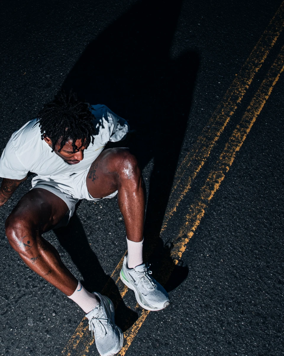
Suppose the square version cuts off the shoe detail that supports the message. That is a layout problem, even if the source image is technically clean. The options are to change the composition, select another approved frame or revise the layout. Making the file larger does not recover the missing communication.
The final note should name exactly what was accepted: the corrected product detail, the two layouts and the final exports. It should not silently approve future crops, new background variants or an animated version that has not been reviewed.
7. Approve a version and keep a clear handover.
Consolidate feedback into one numbered list with an owner for each decision. Separate required corrections from preferences. A required correction explains which agreed condition has not been met; a preference proposes a different creative choice. That distinction helps the team avoid endless small changes without losing the important fixes.
For each final asset, retain the version name, placement, dimensions, reference used for accuracy review and the person who approved it. Include relevant source and usage records in the production handover. If an asset is fictional or speculative, preserve that description wherever the context requires it; do not relabel an exploration as a commissioned campaign.
- Creative: the image matches the approved direction and communicates the intended idea.
- Accuracy: fixed product details and wording have been checked against the agreed references.
- Finish: corrections and enhancement have been reviewed at useful scales.
- Placement: every supplied crop works with the final copy and layout.
- Delivery: the exported file matches the agreed specification and approved version.
These checks make approval specific enough to stand behind. For the earlier stages, read how to brief an AI production studio. For a campaign set, see keeping AI campaign images consistent. Nightwolf's capabilities provide the wider context for bringing production and finishing together.
Sources checked 6 October 2026. Recommendations are an editorial review framework. Archive images are discussion references, not tool benchmarks, enhancement tests or evidence of the fictional project.
START WITH THE IDEA
The idea matters.
So do the details.
Share the brief, the assets you have and what the work needs to communicate.
Discuss your project ↗