
To keep AI campaign imagery consistent, define what stays fixed, assign clear roles to references, approve an anchor image and review the series together. This guide turns those decisions into a practical continuity matrix and a repeatable review process.
1. Decide what needs to stay the same.
A campaign can move from a close portrait to a wide landscape and still feel coherent. Consistency comes from a clear set of relationships: the same product, a recognisable character, a compatible treatment of light and a deliberate visual rhythm. Making every image identical would remove much of the reason to create a series.
Start by separating three questions. Does the image depict the right thing? Does it belong to the same visual world? Does it perform the job assigned to it? These are identity, style and purpose. A beautifully graded image can pass the style test while showing the wrong garment. A technically accurate packshot can preserve identity while feeling unrelated to the surrounding campaign.
Write down a small number of fixed characteristics before selecting images. For a person, these could include face, hair, wardrobe and accessories. For a product, they could include silhouette, surface finish and label placement. Then define the choices allowed to vary: framing, gesture, location or distance. A decision becomes much easier when the team knows whether it is seeing an intentional variation or an error.
VISUAL READING / THE COVER
Look at the relationships, not just the colour.
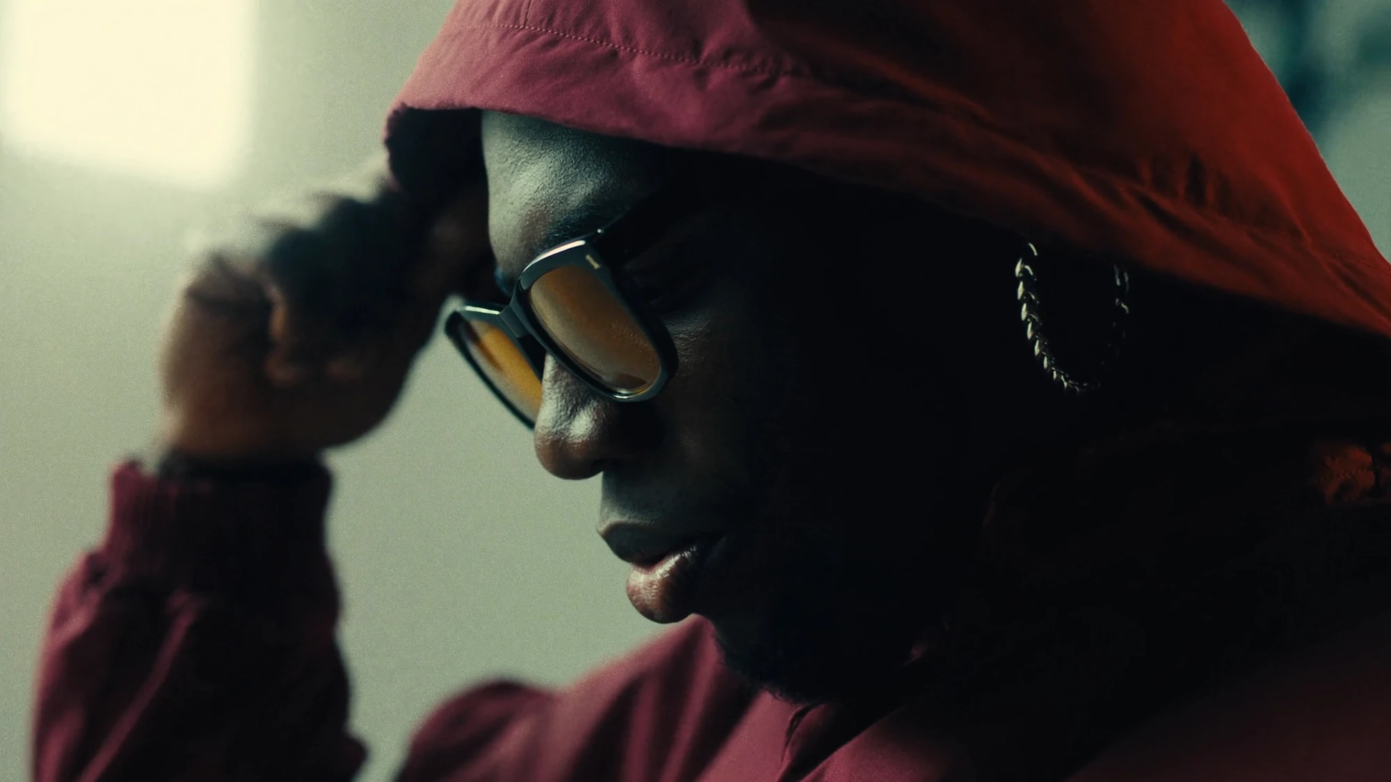
In the cover portrait, the red hood, amber lenses and cooler background create a specific colour relationship. The close crop, visible fabric texture and deep facial shadows also contribute to the image. A second frame with a red jacket would not automatically match all those qualities. Use these as separate review questions; this is an analysis of an archive image, not a claim about how it was produced.
2. Build a continuity matrix before the image set.
A continuity matrix translates an art direction into things a reviewer can actually check. Keep it short enough to sit beside the contact sheet. Describe the fixed attribute, the permitted variation and the evidence used to judge it. Avoid vague instructions such as “premium”, “cinematic” or “on brand” unless you also explain what those words mean in this campaign.
The following is a fictional planning example for an unbranded red outdoor jacket. It is not a Nightwolf client project, a delivered result or a promise about any image model. Its purpose is to show how a team could make approval criteria explicit.
| Element | Keep fixed | Allow to vary | Check against |
|---|---|---|---|
| Jacket | Red fabric, seam layout, zip and pocket positions | Natural folds with pose | Approved front, back and detail photographs |
| Wearer | Face, hairstyle and chosen base layers | Expression and movement | Approved character reference sheet |
| Light | Soft daylight with visible shadow detail | Exposure appropriate to each composition | Selected anchor image |
| Environment | Overcast urban setting | Street, steps or sheltered walkway | Location direction board |
| Composition | Product remains readable | Portrait, medium and wide views | Placement layouts with actual copy |
The matrix also makes exceptions visible. If one frame deliberately moves indoors, record which lighting rules change and which identity rules remain fixed. Without that note, different reviewers may try to correct the same image in opposite directions.
WORKED EXAMPLE
Resolve one contradiction before generating more.
Suppose the reference board combines bright, hard-edged sunshine with a brief asking for soft overcast light. Choose which is the campaign rule. Label the other reference for the quality it still contributes, such as posture or framing. Do not leave two conflicting lighting directions active and expect a coherent selection later.
3. Give every reference a specific job.
An image can be a reference for a subject, a material, a lighting treatment or a composition. Those are different jobs. Organise your reference pack around the decision each asset supports. A front-facing product photograph might be excellent evidence for label placement but poor evidence for the desired atmosphere.
This distinction also appears in image tools. Midjourney describes Style Reference as a way to carry qualities such as colour, texture and lighting, rather than copying the people or objects. Its Omni Reference documentation describes subject references for version 7 and warns that intricate details may not match perfectly. Feature names and compatibility depend on the version; consult the current documentation before choosing a workflow.
The practical consequence is simple: a style reference should not be treated as evidence that the product is accurate. Keep the approved product source visible during review, whichever generation or editing tool you use. If a feature has drifted, record it as an identity issue instead of asking for a general style adjustment.
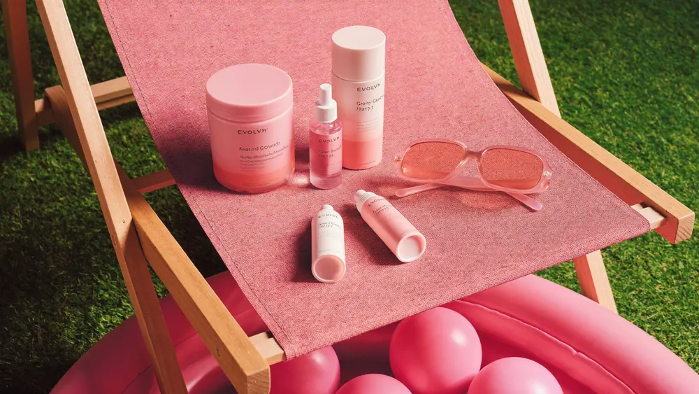
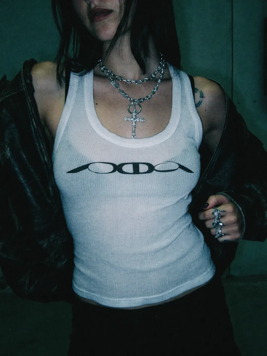
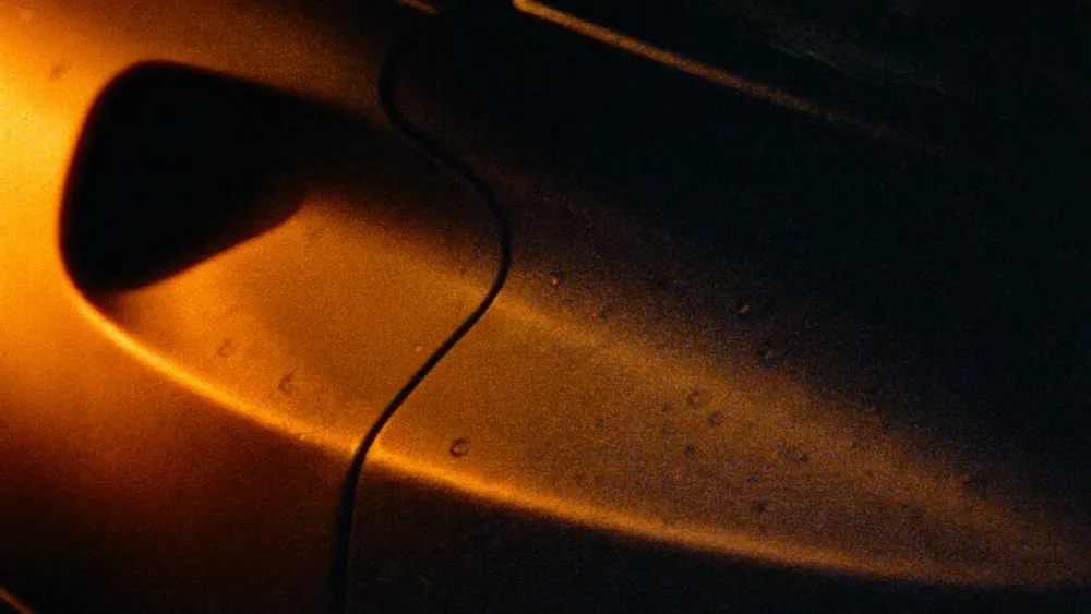
These independent images from Explore illustrate three different reference roles. They are not one campaign or a before-and-after sequence. A useful reference note identifies the quality to borrow and the details that belong only to that image.
4. Approve an anchor, then test a difficult variation.
An anchor image is the agreed reference for the campaign treatment. Choose one that makes the important decisions visible. A striking silhouette may be a good final image but a weak anchor if it hides the face, garment construction or product finish that other frames must preserve.
Once the anchor is approved, test a variation that places real pressure on the direction. Change the viewing angle, move from a portrait to a wider composition or show the product in use. A collection of near-identical images can create false confidence: it has not yet demonstrated that the direction survives the range of views the campaign needs.
Compare the test with the anchor and the identity references side by side. If the new composition works but the product changes, keep the useful framing decision and address the product separately. If the product holds but the lighting looks like another campaign, revise the treatment. This prevents every round of feedback from reopening every decision.
A SMALL TEST SET
Three frames with three jobs.
- Anchor: establish the subject, material and lighting clearly.
- Stress test: show the same subject at a harder angle or scale.
- Placement test: put the image into the intended layout with copy.
Approve the relationship between these frames before expanding the series. Three is an illustrative review structure, not a required production quantity.
5. Use variety without losing the visual world.
A campaign series needs changes of emphasis. One frame can establish a place; another can concentrate on a person; a third can show a tactile detail. The useful question is whether those changes make the idea richer while retaining the characteristics you chose to protect.

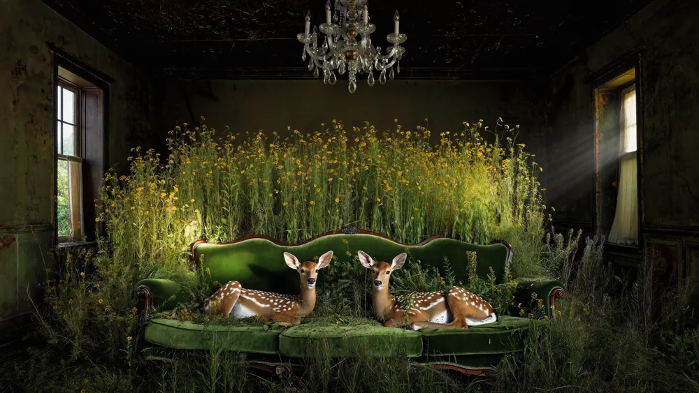
These separate Explore images share visible relationships in greenery, directional light and shadow, while changing the subject and setting. They illustrate how a reference board can connect different scenes through specific visual qualities. They are not presented as a single campaign. For your own series, use the continuity matrix to decide which shared qualities should become rules.
For your own series, lay all the selected images out at equal size. Look for accidental repetitions as well as outliers. If every frame has the same distance, pose and subject position, the series may need another visual role. If one image has a completely different contrast or material finish, decide whether that difference is purposeful before accepting it because it looks impressive on its own.
Review a second time with the actual layout sizes. The image that dominates a contact sheet may have a minor role on the website, while a small thumbnail might become the main campaign placement. Selection should serve the intended sequence and use.
6. Diagnose drift before choosing the fix.
“This one does not match” is a starting observation. Turn it into a specific diagnosis. Is the shape wrong, the surface too glossy, the expression unrelated, the shadow direction inconsistent or the crop removing the identifying detail? Each problem suggests a different next action.
| What changed? | What to check first | Possible next action |
|---|---|---|
| Product geometry | Silhouette, seams and proportions against approved views | Revise the source, regenerate the frame or use controlled product compositing |
| Colour or contrast | Compare under the same viewing conditions | Adjust the grade if the underlying material and light remain credible |
| Character identity | Face, hair and accessories across different angles | Return to the approved subject reference and review the new result |
| Logo or typography | Compare with the supplied master artwork | Place approved artwork with suitable perspective and finishing |
| Composition | Test in the intended placement with copy | Reframe, extend or rebuild the composition, then recheck visible details |
These are production options, not automatic corrections. A colour adjustment cannot repair a misplaced pocket. Compositing a correct product into a frame also requires attention to perspective, lighting, contact and edge quality. Assess the whole finished image after any local repair; a correct detail can still look detached from its surroundings.
BETTER REVIEW NOTES
Describe the mismatch and the reference.
Instead of “make frame four more consistent”, write: “Frame four moves the left pocket higher than the approved front view. Match that construction while keeping the current camera angle.” A precise note protects the decisions that already work and tells the next reviewer what needs checking.
7. Check the campaign at its final size.
A consistent master image can become an inconsistent campaign asset after cropping. A portrait crop may remove the product; a wide crop may expose an unfinished edge; a small placement may make a logo unreadable. Treat each final composition as something to review, not merely a file to export.
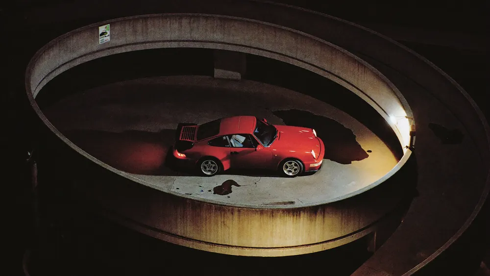
Test the work with real headlines and interface overlays where these are known. Check both the focal point and the breathing room around it. If one format needs a different composition, describe that requirement explicitly rather than hiding a compromised crop in the export folder.
Keep the approved series and the final exports connected through clear filenames and version records. Store the reference pack, selected anchors, review decisions and final crop list together. That gives a later adaptation a reliable starting point and reduces the chance of an old or unapproved image returning to the campaign.
A final continuity check for brands and agencies.
Before signing off a set, review it once as an art director and once as a person encountering the campaign for the first time. The first pass asks whether the rules hold. The second asks whether the images communicate an idea and give the audience something worth looking at.
READY FOR REVIEW
Seven questions for the final contact sheet.
- Are the product and character identifiers consistent with the approved sources?
- Does each variation have an intentional role in the campaign?
- Do light, colour and texture support the agreed visual direction?
- Are any apparent before-and-after comparisons supported by real source material?
- Have local corrections been checked in the complete image?
- Does every final crop preserve the intended message and important detail?
- Can the next team find the approved assets and decisions?
Consistency is an ongoing set of creative decisions. Reference tools can help carry a direction, but selection, precise feedback and finishing determine whether the delivered images belong together. The goal is a series with enough stability to be recognisable and enough variation to remain interesting.
For the broader production stages, read How AI Production Works. To put these requirements into a project document, use How to Brief an AI Production Studio. You can also explore Nightwolf's selected work or discuss a campaign through our contact page.
Tool references checked on 1 October 2026 against Midjourney's official documentation linked above. Archive images illustrate the review principles; no tool attribution, performance result or unverified client process is implied.
A WORLD THAT HOLDS TOGETHER
Build the idea.
Shape the whole series.
Bring the campaign direction, the assets you have and the places the work needs to live.
Discuss your campaign ↗