
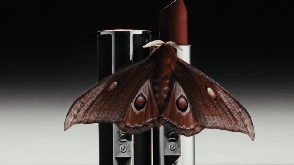
Describe what the light should reveal. Then turn the mood into decisions an artist can build and a reviewer can assess.
1. Give the light a communication job.
“Make it cinematic” describes an ambition, but it leaves the important choices unresolved. Should the viewer notice the product's outline, the texture of its surface or the atmosphere of the room? A lighting brief becomes useful when it explains what the light must reveal and what can remain quiet.
For this worked example, imagine an uncommissioned desk lamp: a short brushed-metal stem, a dark green shade and a small circular base on an oak table. The proposed image should communicate a calm place to work at the end of the day. This lamp and its campaign are fictional. We are developing a brief and review method, not presenting a generated test or a real product specification.
The intended hero is the lamp. The tabletop gives it context; the room should not compete with it. We want the shade's silhouette to read clearly, the metal to retain a brushed appearance and the pool of light to feel contained. Those are decisions someone can assess. “Premium”, “beautiful” and “cinematic” alone do not tell a reviewer which version meets the brief.
This is a deeper lighting exercise within a wider AI production brief. It does not replace the need for an approved product reference, intended placement or factual claims review on a commissioned project.
2. Name the sources and their roles.
Begin with a simple description of where the light seems to come from. In our fictional room, a broad window is to the left of the camera and the lamp itself is switched on. The window describes the object's shape; the lamp creates a warm pool on the desk. The rest of the room is darker, with enough detail to understand the setting.
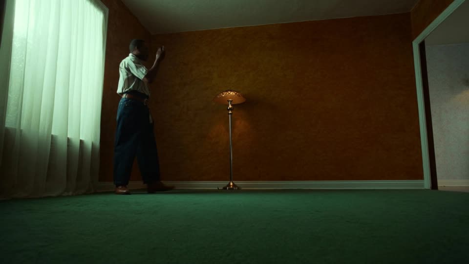
Separate source direction, softness and brightness in the brief. A soft source does not automatically mean a bright room. Broncolor's lighting explanation distinguishes hard and soft light through shadow transitions and discusses the importance of source size and distance. We can borrow that descriptive vocabulary for an AI brief without pretending a prompt is a physically controlled studio. Source: broncolor on hard, soft and diffused light.
Our direction would be: broad, soft illumination from camera-left; a weaker warm glow below the shade; no equally strong light from the right. That final constraint reduces ambiguity. If every edge is brightly outlined, the result may no longer communicate the quiet room we intended.
Do not specify exact lamp power or camera exposure unless those values have a real purpose and a workflow that uses them. For this proposed generative scene, visible relationships are the useful criteria: which side is brighter, how the shadow edge looks and whether the lamp remains separate from the wall.
3. Build a lighting decision table.
The table below turns the fictional concept into a set of independent decisions. It can guide an artist, a generation prompt or feedback on a candidate. It is an art-direction plan, not evidence that any model will reproduce each instruction exactly.
FICTIONAL CONCEPT / PROPOSED DIRECTION
A quiet desk at dusk
One imaginary green desk lamp on an oak table. A modest reading pool, visible brushed metal and enough surrounding darkness to make the setting feel calm. No brand, commission or performance result is implied.
| Decision | Proposed direction | What to inspect |
|---|---|---|
| Main source | Broad window-like light from camera-left | Left-facing surfaces read clearly without flattening the object |
| Practical light | Warm glow from beneath the shade | A local pool on the oak, with a plausible relationship to the opening |
| Background | Subdued neutral wall, darker than the lit product | The green shade remains distinct without a decorative halo |
| Metal | Restrained highlights along the brushed stem | It does not become chrome, plastic or a glowing tube |
| Colour | Warm lamp glow, relatively neutral window light | The shade still reads as the intended green |
| Composition | Three-quarter view, base visible, clear space to the right | The light supports the product and leaves usable copy space |
Notice how the material requirement changes the lighting instruction. “Shiny metal” would invite a different surface from “brushed metal with restrained highlights”. If the object itself is real, its reference should settle that question. An attractive interpretation must not silently replace the actual finish.
Also separate a mood image from a factual product-colour reference. A deliberately warm scene can help communicate atmosphere, but it may be insufficient on its own for someone choosing a precise colour or finish. Agree what the campaign image needs to demonstrate and where a neutral reference is needed.
4. Translate the brief into a prompt.
A prompt should carry the decisions in a readable order: subject and fixed features, setting and composition, then the lighting relationships. Avoid adding competing style instructions merely to make it sound sophisticated. For an existing product, start with the approved reference and make its protected features explicit.
ILLUSTRATIVE PROMPT / NOT TESTED
Create a still-life concept of an imaginary dark green desk lamp with a short brushed-metal stem and a small circular base, on an oak desk at dusk. Three-quarter view with the whole base visible and quiet space to the right. Broad soft window light comes from camera-left. The switched-on lamp adds a restrained warm pool beneath the shade. Keep the wall subdued and the metal brushed rather than mirror-polished. Preserve a readable green shade and avoid a bright halo around its outline. No lettering or brand marks.
This is a starting instruction, not a reproducible recipe. No model, seed or generation settings are reported because no generation was performed. In actual production, retain the source reference, model and settings that were used, along with the resulting files, so later revisions can be traced.
Dreamina's relighting page describes uploading a photograph and specifying lighting through text; it also describes selecting areas for targeted edits. Those are vendor-described capabilities. The claim that subject details remain unchanged should still be checked against the particular output, especially when a product's geometry or finish matters. Source: Dreamina photo-relighting overview.
If the composition is already approved, a focused revision request is more useful than restarting the whole description. For example: retain the camera angle and object shape; reduce the bright stripe on the stem; keep the light pool under the shade. Review the rest of the image after any local edit as well.
5. Judge materials and colour separately from mood.
A convincing mood can distract from an incorrect surface. Review the finish on each relevant part: shade, stem, base and tabletop. The fictional lamp should not acquire a different material just because a glossy highlight looks dramatic. Use the original product evidence to resolve ambiguity on a real commission.
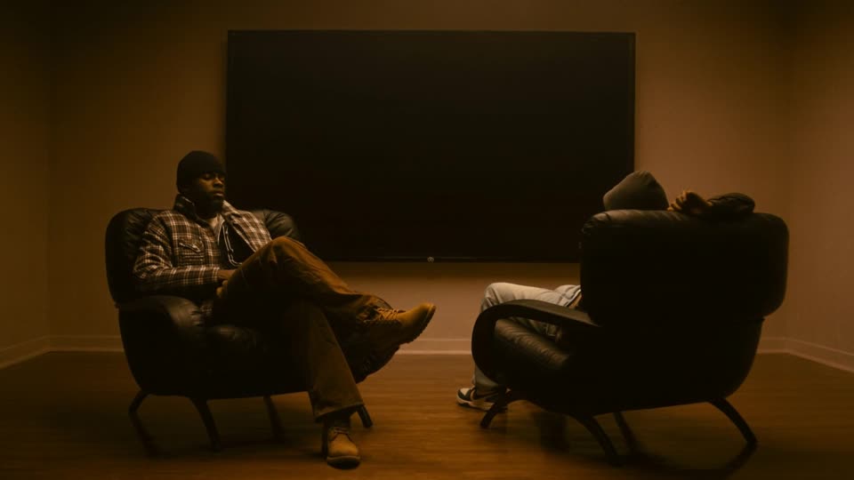
For the desk-lamp exercise, imagine a candidate with the right atmosphere but a mirror-like stem. The feedback is not “less cinematic”. It is “retain the current light direction and room contrast, but restore the intended brushed-metal finish”. That names what already works and isolates the change.
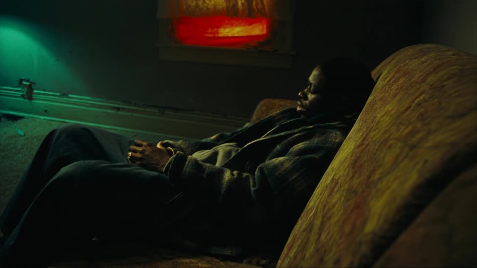
The Paris–Tokyo studio Spiral distinguishes packshot and editorial product imagery in its public offering. We read that as a useful distinction between delivery purposes, not proof of its broader accuracy or performance claims. For our fictional lamp, a neutral descriptive view and a dusk campaign scene would answer different questions. Source: Spiral's product-photography offering.
6. Make the revision note as precise as the brief.
Compare the candidate with the decision table rather than an expanding list of adjectives. First ask whether the product is correct. Then check whether the light makes the intended features readable. Finally assess atmosphere and copy space. A beautiful room is not a successful product scene if the product's base has changed or disappeared.
For our fictional example, a useful revision note could read: “Keep the framing and the soft left-hand light. Reduce the lamp's warm spill so the desk grain remains visible. Keep the green shade separate from the wall without adding a rim around every edge. Preserve the existing base diameter.” Each sentence names a visible relationship.
- Shape: compare the outline, joints and proportions with the approved reference.
- Light: identify the apparent main source and any secondary source.
- Contact: check how the base sits on the tabletop and how its shadow supports that contact.
- Material: inspect whether highlight behaviour suits the intended finish.
- Colour: distinguish an intentional colour cast from an unintended product change.
- Delivery: review the intended crop with the actual copy or layout in place.
Keep the version that was reviewed and record which decisions were accepted. Once the direction is approved, address resolution and upscaling for the intended use. Do not let a later enhancement quietly alter the lighting or material decision that earned approval.
The value of this exercise is a shared standard for the image. “Calm” becomes a restrained light pool, a readable silhouette and a background that supports the product. That gives the creative team something concrete to build and the client something concrete to assess. Explore Nightwolf's art direction and creative production capabilities to connect that direction with the wider campaign.
Sources checked 8 October 2026. This article contains an original fictional brief and an untested illustrative prompt, not a client project, lighting simulation or model comparison. All four Explore images are independent archive references. No new imagery was generated or relit for this article.
MAKE THE LIGHT MEAN SOMETHING
A clear direction.
A considered image.
Share the product, the feeling and the details that must stay true.
Discuss your project ↗